June 10, 2020
by Patrick van der Bogt
Visualisation was one of the key components of last week’s Learning Experience Design Conference. So let’s practice what we preach. On Wednesday June 3rd Marieke Welle Donker and I put together a Design Lab session about testing. We chose an interview format where I would ask her questions based on a general outline of helpful topics for our participants. We precluded the use of powerpoint for ourselves. It is fun to challenge yourself to come up with different ways of communicating. What most fascinates me is how presenting the proces of structuring content, conceptually and visually, meets the need for fixed anchors as well as openness.
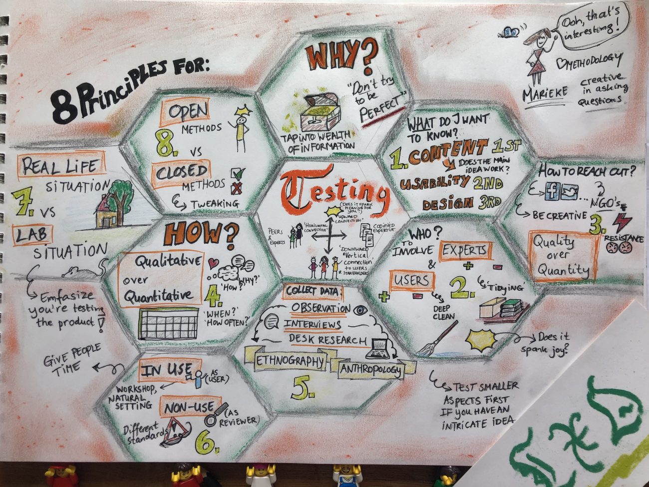
During this particular session about testing I tried to capture Marieke’s 8 principles into a live visualisation with a large sheet of paper and some pencils. The camera would alternate between Marieke talking and my drawing hand over my workbench. (The workbench proved to be a favourite during the prototyping session the day before.) Thankfully she chose to present her knowledge in the interview through the structure of a set of core ideas. I wouldn’t have been up to the task to deliver something that was structured and somewhat pleasing to look at. You can decide for yourself whether I succeeded in that respect. Truly, I admire people who have the skillset to visualise anything complex in a live setting with a consistent style.
Aesthetics and effectiveness aside, for the audience to know that a visual representation is being made could help them relax a bit and become more receptive to what is being said. For me, the fact that Marieke was able to pick eight principles among her extensive range of experiences and knowledge is already quite a feat. It breathes a message of being as complete as necessary, but with ample opportunity for variation and elaboration if need be. So narrowing down the amount of talking points, combining this with the promise of a complete overview might be conducive for questions about particularities and translations to other contexts, little sideways and backstories.
A final note on the hexagonal ‘beehive’ structure of the drawing: it might help you to compartmentalize the information but also restructure it if you like. Cutting out separate hexagonal tiles and displaying them in front of you might invite different constellations and connections… In this way the structure in which content is presented is broken up and an open space emerges for new connections.
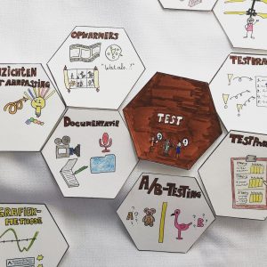
The biggest take-away for Marieke and me is our plan to make a bunch of how-to-clips as a spin-off of her stories relating to the eight principles and my visualisations. It may even open up to contributions from students and others as well. This is another way of opening up the narrative to others.
Let me know if you’re interested in such a playlist or in a contribution to its content. 🙂